Eco Dilemma Advisor

👀 Context
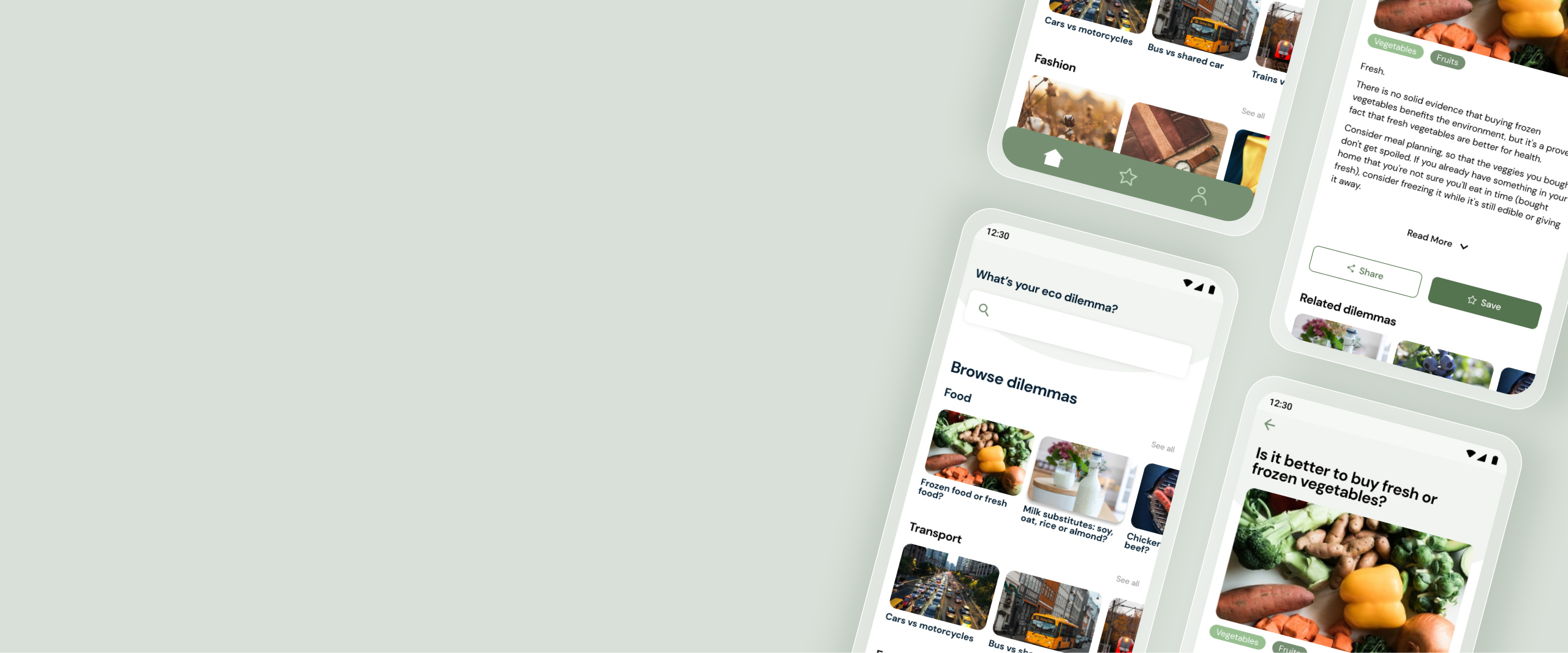
Eco Dilemma Advisor is a tool that allows people to find information about the environmental impact of their everyday choices.
This project was completed as part of the final project with Tech Labs. Our group consisted of two people following the UX Design track and two from the Data Science track.
My role as a UX designer included user research, ideation, and prototyping.
💭 Challenges
With all the organic, plastic-free, meatless alternatives on the shelves of retailers and supermarkets, it seems like people are becoming more aware of the impact their habits have on the environment. However, despite common advice such as ‘prefer public transport, avoid food waste, buy local’, making sustainable choices can be difficult because there’s never a straightforward answer.
In the user research, we also learned that people are aware of green-washing so they don’t know what information is true. It’s not easy to search for it, and there’s also conflicting information that can make it even more challenging.
🎯 Goal
A tool that helps people consult, rather than research, providing them with concise, relevant, and fact-driven advice.

🏗️ Process

First of all, we wanted to understand to what extent people are concerned about their environmental impact and what they do about it. These two topics served as a guideline for the conversation with 6 people, and these were the main insights:

We also did a market audit, and we noticed that many of the current tools that show the footprint impact leave a negative feeling, making the person feel guilty or powerless unless they change their habits completely.
Understanding our user
With the user research, we identified 2 main personas:
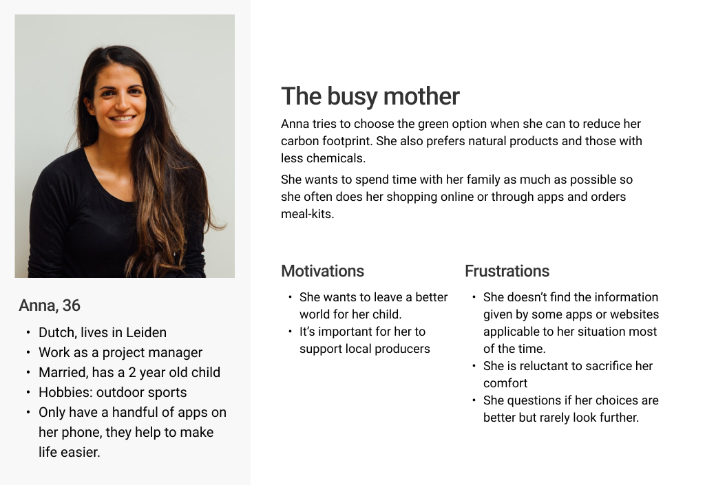
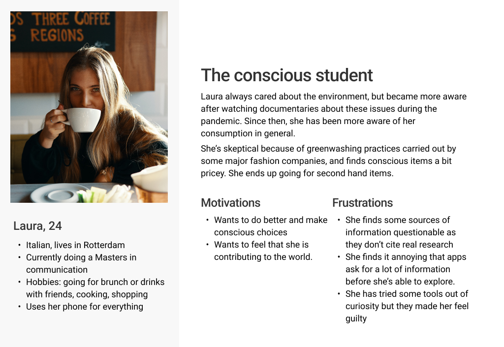
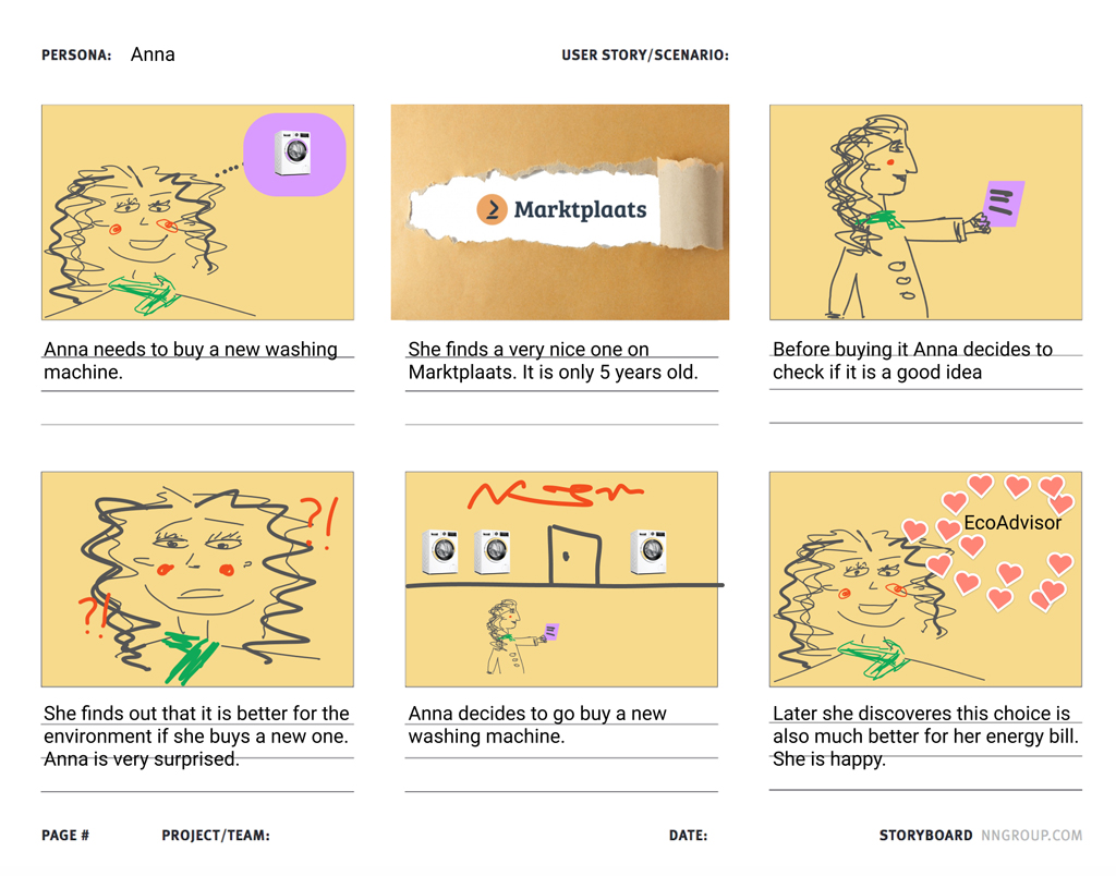
We then decided that a mobile app would be an appropriate solution for being accessible wherever the person is, when shopping for example.
During the research everyone used examples to illustrate their concerns: ‘is it better to have local meat or veggie alternatives that use more transport?’, ‘is fake leather better than real leather’ which lead us to ask
How might we answer green dilemmas in a practical way?
Making sense and narrowing it down
We mapped out the topics raised by the interviewees and added our insights from a brainstorming session.
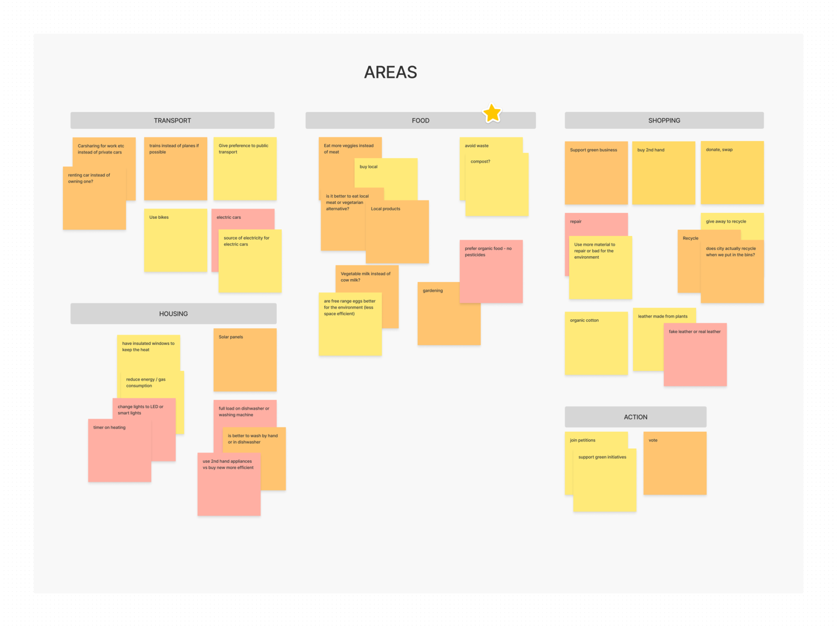
Our colleagues from the data science path looked into datasets to make this product feasible. Due to the availability of datasets and time constraints, we decided to narrow down the scope to ‘food’ category in the Netherlands, so we could work on providing more detailed and relevant information.
We already had some real questions from the research, so we decided to start by answering those.
Prototyping and testing
Although we focused on the food category, we wanted to see how the app would be in its complete version for the prototype so I included other categories such as transport, home, and shopping.
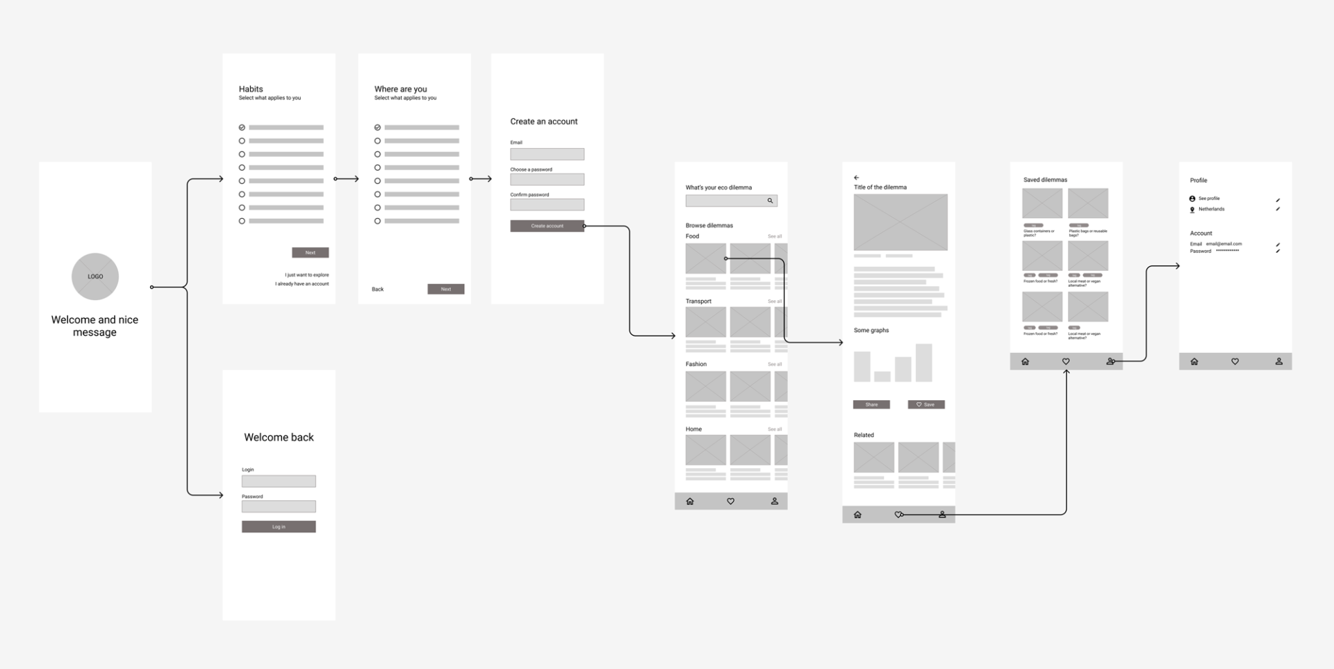
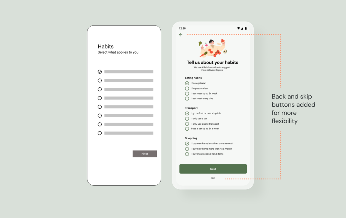
In order to provide relevant information some information about the user is needed, but we wanted to allow it more flexibility: they can choose either to personalise the experience or to start using the app right away and personalise it later.
In the usability test, our users weren’t happy about not being able to give up on the process of filling up the details for personalisation, so I included buttons to go back and skip at any step.
The save button was also changed from heart to star, as they associated the heart as ‘like’ and not ‘save.’
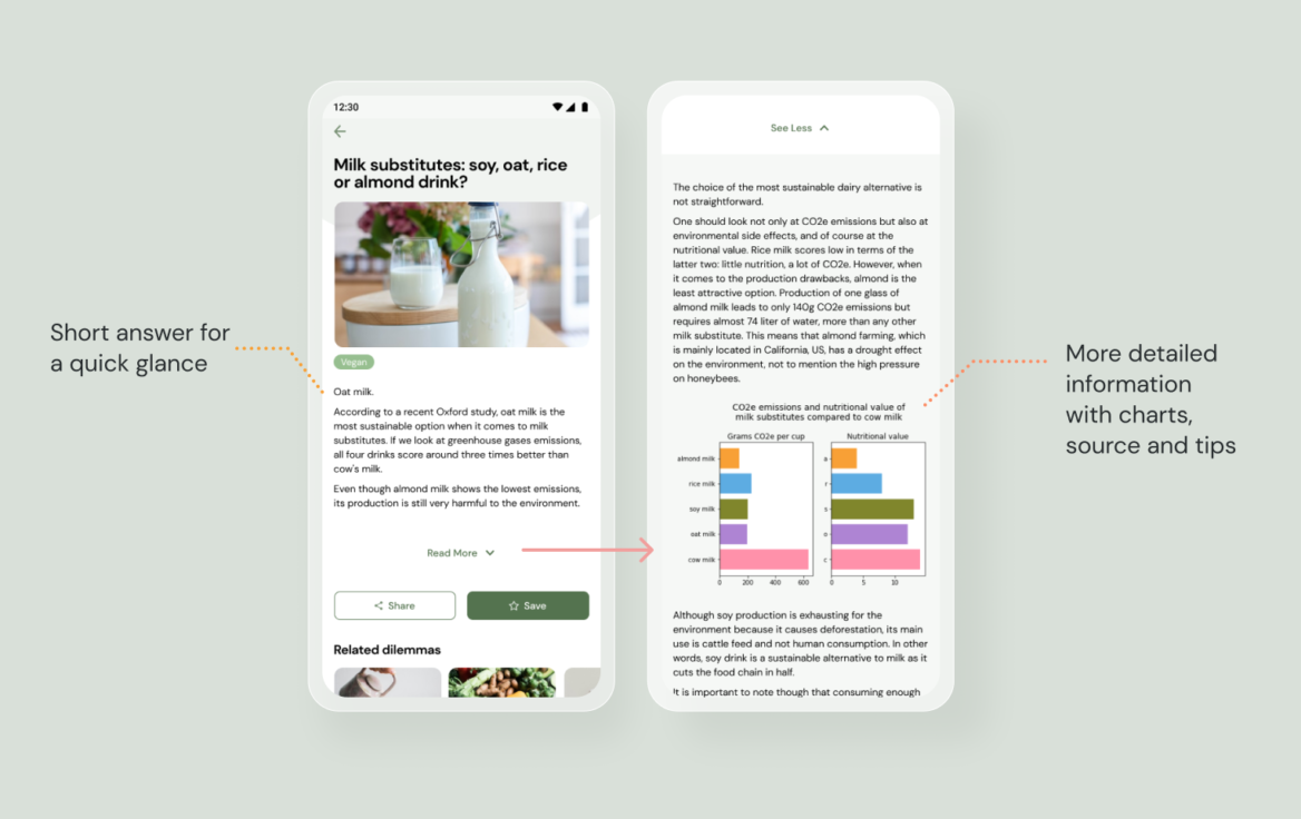
One challenge was deciding how much information we should provide in each answer.
On the one hand, it had to be short so the users could read it quickly, and on the other hand, it should provide a decent amount of information with data with sources and actionable tips. I added a ‘read more’ expandable tab so it included both options.

🗒️ Takeaway
Working with the data science colleagues during the whole process enabled us to have a better idea about the feasibility of this product, based on available data sets. However, we would still need further research to determine what data we actually need from the users to ensure the information they get is relevant.
The next steps in developing this project would include defining and researching dilemmas for other categories such as household and transport. Another concern was about the copy being accessible and friendly. I would also look into how to make this app more compelling for everyday use, perhaps with gamification.