Act Attack
👀 Context
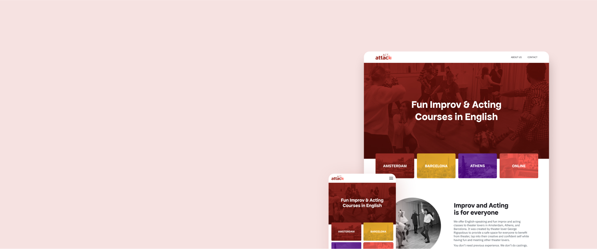
Act Attack is a theatre school that seeks to improve people’s confidence and creativity through acting and improv courses. The main audience includes young professionals and students between 20 and 35 years old.
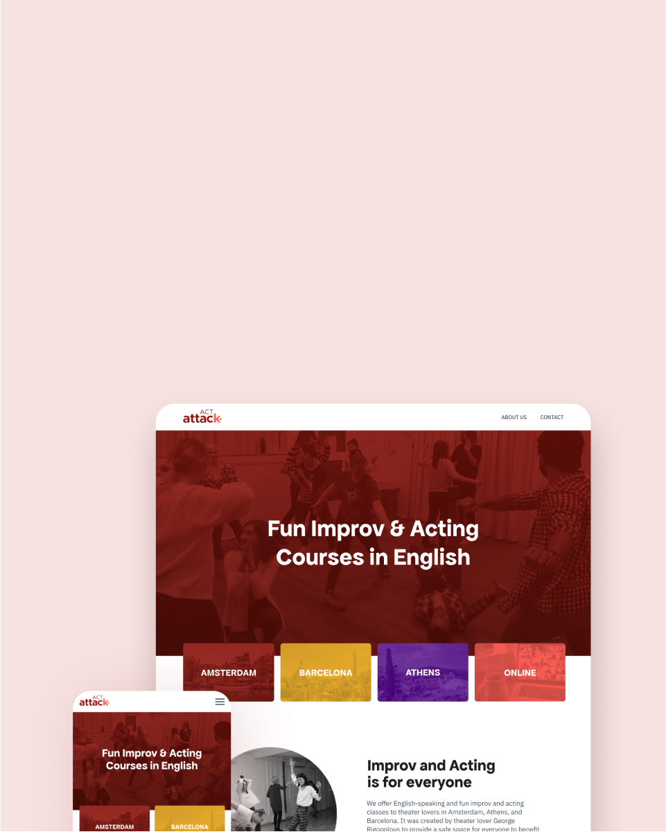
Originally based in Amsterdam, Act Attack has also recently expanded to Barcelona and Athens, and has plans to expand to more cities in the near future.
For this project, I collaborated with another UX Designer during the whole process. My role was to do user research, rebrand the visuals, prototypes, and user testing. I’m also developing the website in WordPress.
💭 Challenges
In order to inform prospective students about new courses, Act Attack has three websites, one website for each location. They look outdated, don’t reflect the message that the company wants to communicate, and need a better user experience. In general, Act Attack’s brand needs to be more consistent across different channels.
After conducting a user-research, I found that the problem was more serious: the website was confusing for prospective students, especially in regard to signing up for the classes which lead to trust issues.
Additionally, the business spends a lot of time with customer service, sales and updating the three different websites.
🎯 Goal
To provide a unified and trustworthy experience for Act Attack’s prospective students, we identified two main objectives:
- Redesign the brand to connect better with the audience
- Redesign the website to offer a better user experience to the audience while meeting the needs of the business.
🏗️ Process

Understanding the current situation
First, we wanted to learn about the team’s perspective on Act Attack. The team has been growing organically so it’s important that people are in tune. For that, we had a workshop to rethink the message, brand values and purposes and used this to develop the brand strategy.
Positioning in the market
With the competitive analysis in Amsterdam, we found out that most of the acting courses are more career-centred and prepare actors for auditions, so we saw an opportunity that Act Attack was naturally leaning towards, providing acting classes in a fun and less formal way.
Visuals
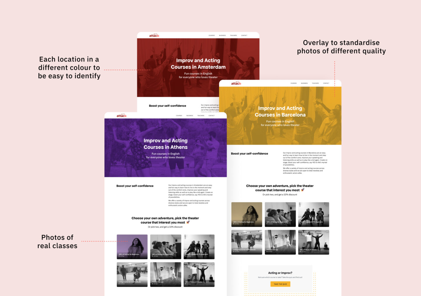
For a more cheerful vibe, I proposed adding more colours on the brand. We then decided to use a colour for each city, that would be easily identifiable on social media or when promoting the classes.
To approximate the company to the students, I proposed to use real photos of the classes as it feels more genuine. The colourful overlay not only would make these photos look more branded, but also help to standardise photos of different quality taken with different types of cameras during the classes.
The Audience in Amsterdam
To get to know the audience better, I attended the first class of two of the courses with about 12 students. I had the chance to learn more about them and their motivations and frustrations. From that, I identified two audiences which I incorporated into a primary and a secondary personas:
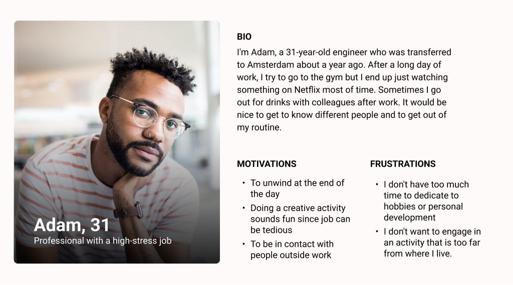
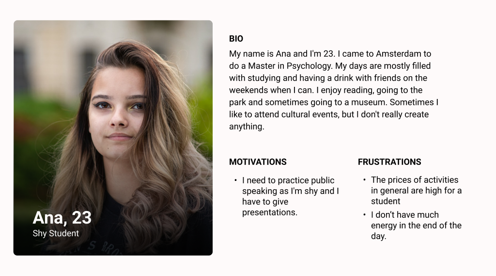
Talking to 5 current students that were more advanced in the course, I learned that in general, they are happy with the classes and didn’t have much problem finding information on the website. However, some of them reported finding it a bit confusing to sign up, and even that ‘it felt a bit dodgy, but in the end it was fine’.
I chose Adam for the journey because three of the participants I spoke with had a more similar profile. They were excited about the activity, but didn’t contact the business before signing up.

Unifying the experience for the business
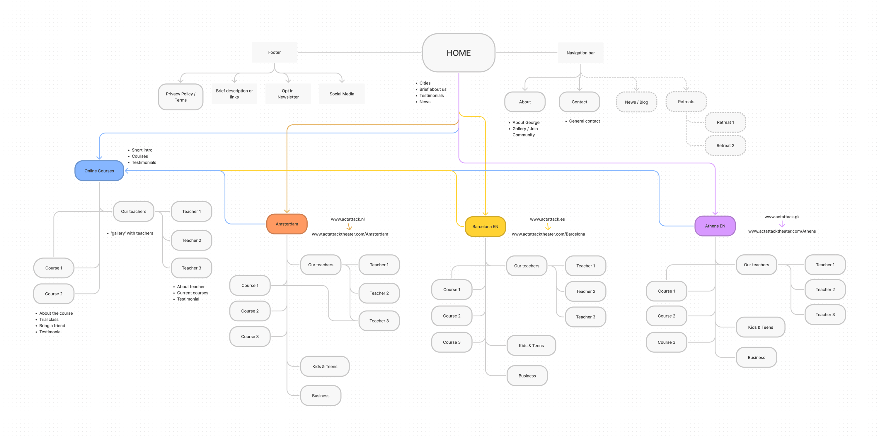
Having three different websites has been time-consuming, the team has to log in to each website separately and common content such as blog posts are copied and pasted to each one of them. Consolidating them into a single website would make maintenance more practical.
A site map helped me to figure out how these websites would be connected.
Simplifying the signup process
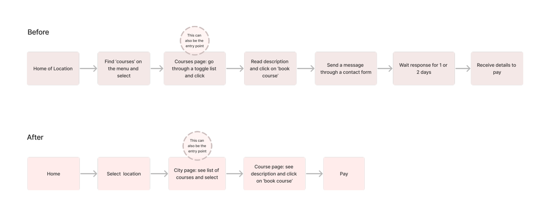
The user research showed that the signing-up process was the main point of friction for the potential student. It’s also time-consuming for the business as they take care of each booking individually.
Testing – First Findings
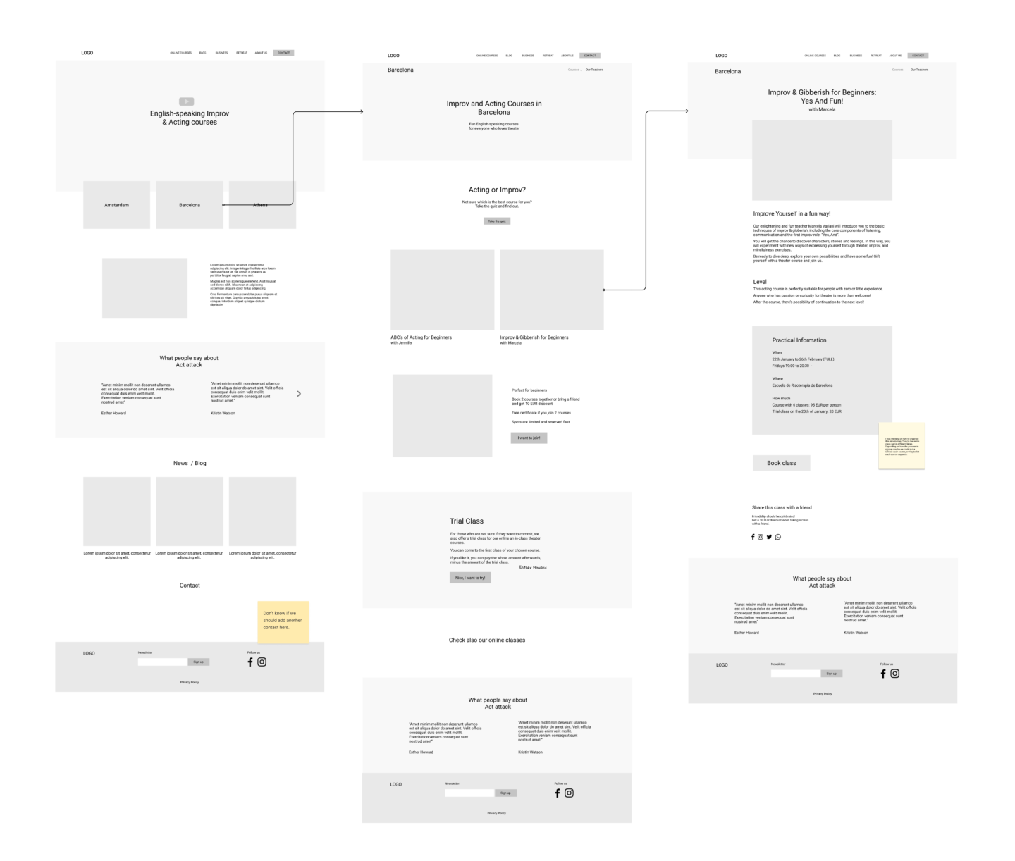
I conducted a usability test with the first wireframes with 3 people only. This was already enough to see that some things didn’t work well and had to be iterated:
- Double menu, one for the links that are common for all websites (such as about and blog) and the other for the specific location. They were added to the footer.
- Trial Class section on the courses page. It was moved to the course description page.
Testing – Second Round
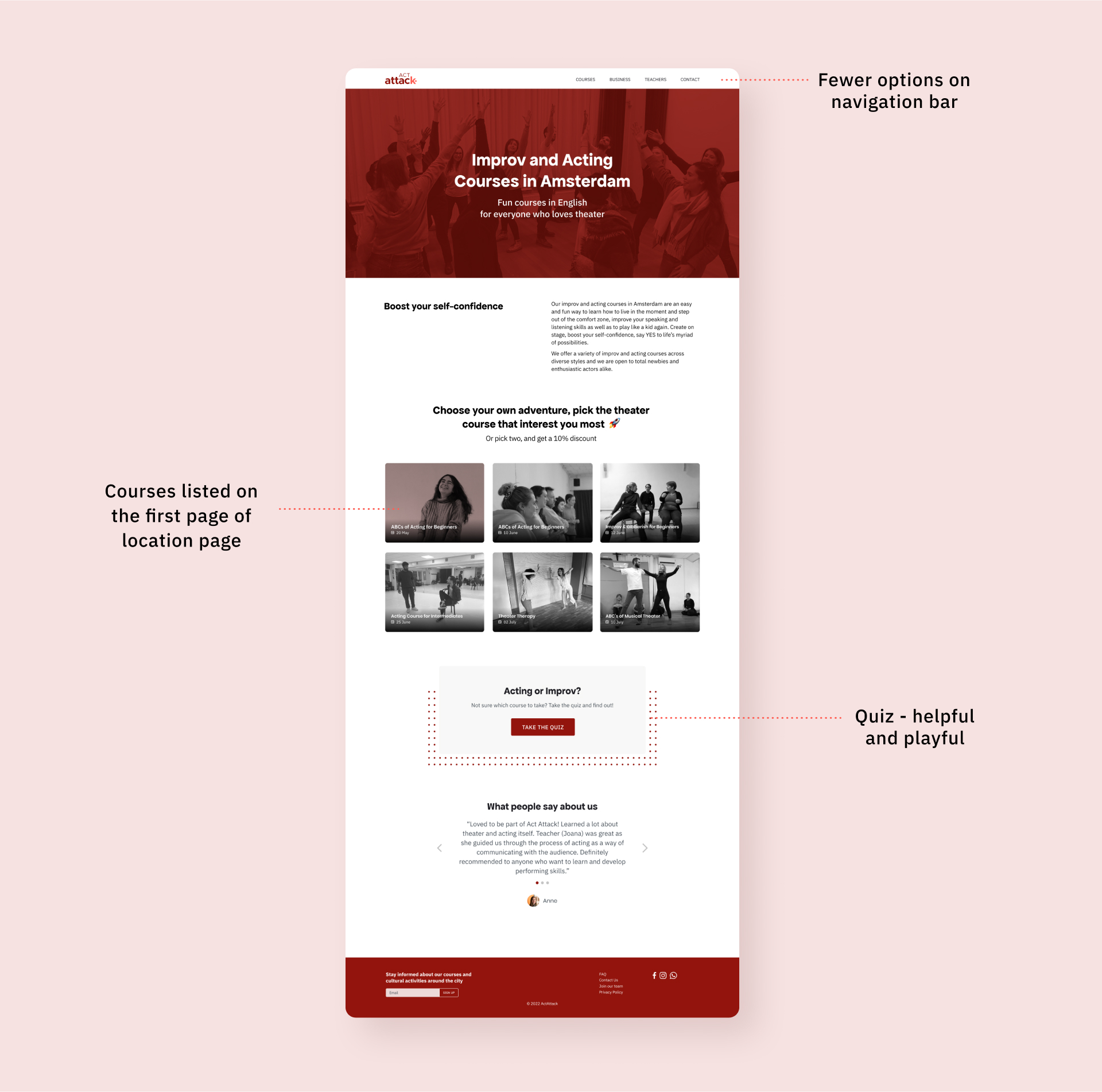
I conducted a remote usability test with 5 people, being 3 from Amsterdam and 2 from Barcelona. These tasks are similar to those used in the research conducted by my colleague in the beginning of the process.
- Find a course and book
- Book a trial class
- Contact the company
Apart from booking a trial class, they were able to complete these tasks fairly quickly. This was a trade-off we had to make as it was a business choice to incentive the sale of the whole courses over the trial classes.
Development
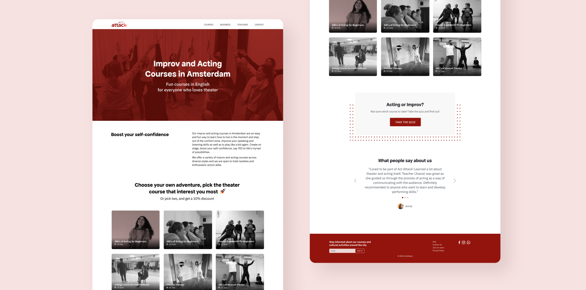
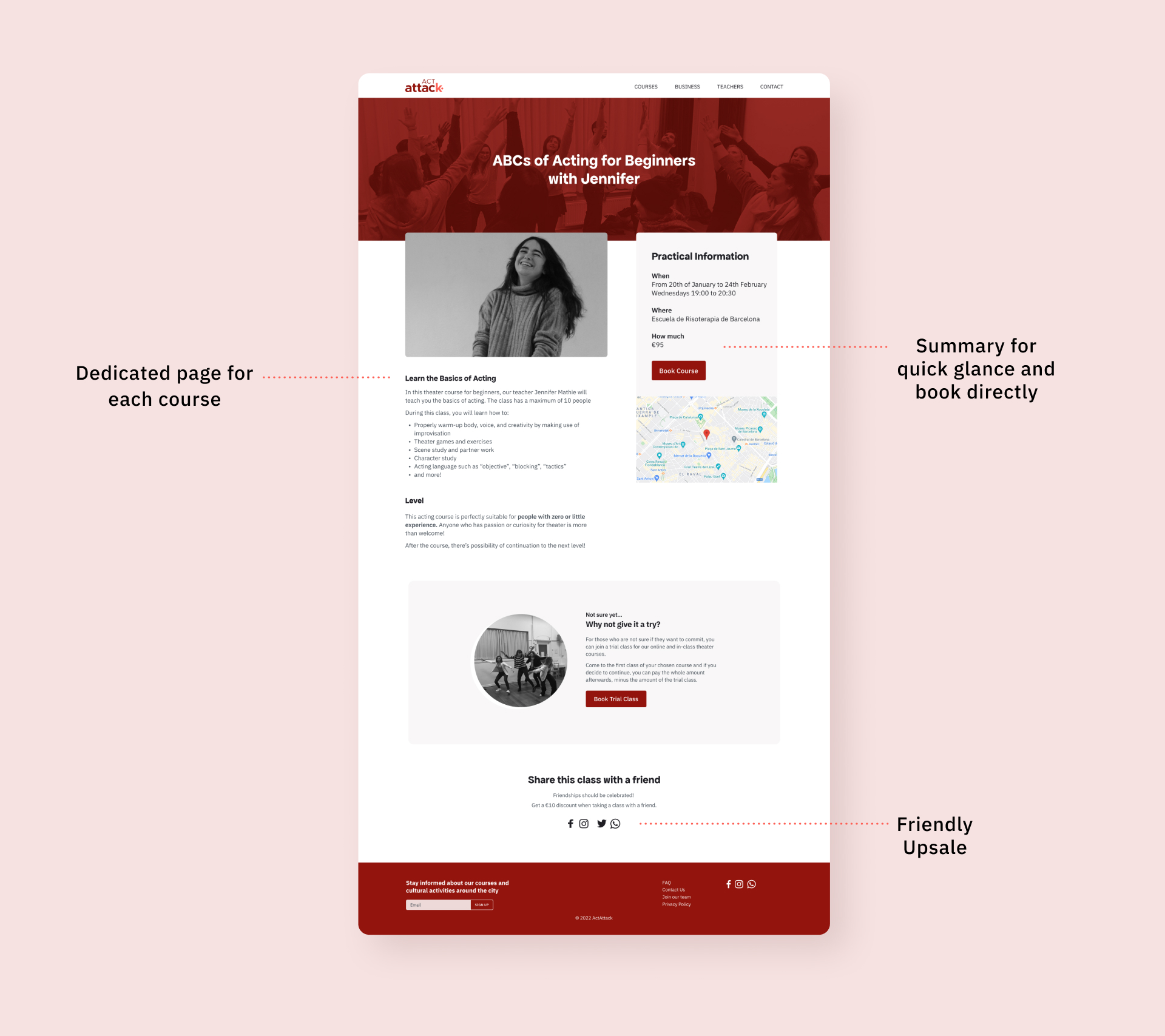
I developed a responsive website on WordPress as it’s a platform the team is already familiar with. For that, I used Oxygen builder.
Handling visitors from different locations
To be clear for visitors from different cities, the home page has clear links that lead to each desired city and each location can be used as its own ‘home page’. Each page is going to be optimised for SEO to have better results in multiple locations.
Handling website updates
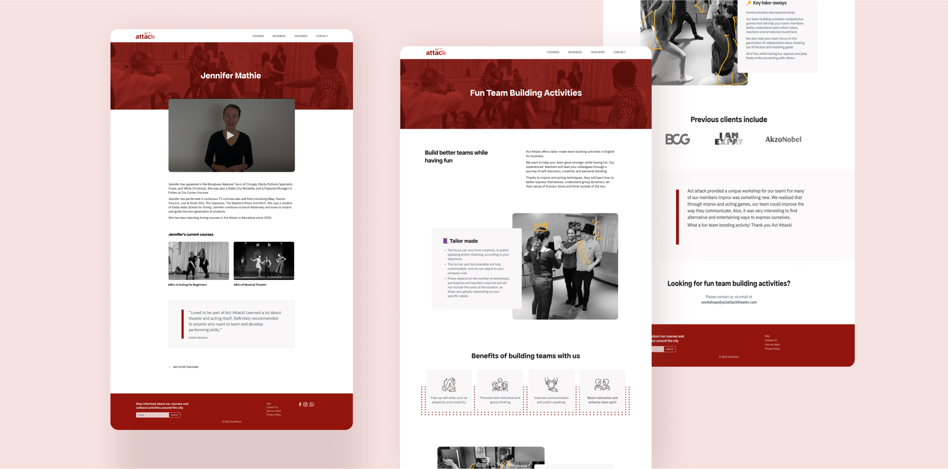
In order to make it easier and quicker for the team members to update courses, teachers, locations, and testimonials, I created custom post types with custom fields. The sales on the website will be connected to a CRM and email service to better handle the sales and customer support.
As Act Attack is expanding quickly, one of the main concerns was to make the website scalable and easy to update.
🗒️ Takeaway
This project made me think more holistically considering the different end users, both the audience and the team who is going to update the website. I also learned a about the possibilities of CMS as well as HTML / CSS which is incredibly helpful when pondering the design possibilities and limitations.
I’m looking forward to seeing the impact of the new design on both of the users when it’s finished. For that, the next steps would be setting up a feedback system to measure students’ satisfaction and interviewing the team to see to what extent the day-to-day process improved.